The current Venus brand and interface design is based on 2020 standards and requirements and an update is needed to accompany the protocol’s new vision.
References
Summary
The Venus brand is a globally recognized name in cryptocurrency and DeFi thanks to the project’s early success and position as a financial primitive (lending, stablecoin). However, with the departure of the supporting team and arrival of a new one comes the necessity to establish a new identity and mark a new phase in the evolution of the Venus brand. For this reason, this proposal addresses the importance of refreshing the Venus brand identity to signal to the market the new face of Venus, while maintaining the name in order to minimize the lift and resources needed to reset the optics and accomplish the goals of this initiative.
Motivations
Because a UI update does not change the feature offering, brand premium is the difference between Venus and competitors. ROI estimates show XVS market cap could increase 65-145% by simply improving the UI and the team’s dedication to constantly working to improve the user experience.
DeFi Protocol
Market Cap ($MM)
TVL ($MM)
Market Cap / TVL Ratio ($MM)
Aave (Current*)
2,675
12,870
0.21
Compound Finance (Current*)
1,150
8,140
0.14
Venus (Current*)
155
1,830
0.08
Venus (Improved Ratio)
260-380
1,830
0.14-0.21
Venus Gains
+65-145%
*Updated Jan 10, 2022
Specifications
Development
Venus needs an interface that can seamlessly adapt additional feature view components and data dashboards. This refresh will also include an update to our front-end Continuous Improvement processes to incorporate best practices, like:
Unit testing coverage standards
Linting standards
Branch management standards
Regular third-party code review
Redesign
Updates are proposed include:
Brand graphics & colors
Interface styles & fonts
App layout
Data views & charts
Landing page graphics & information
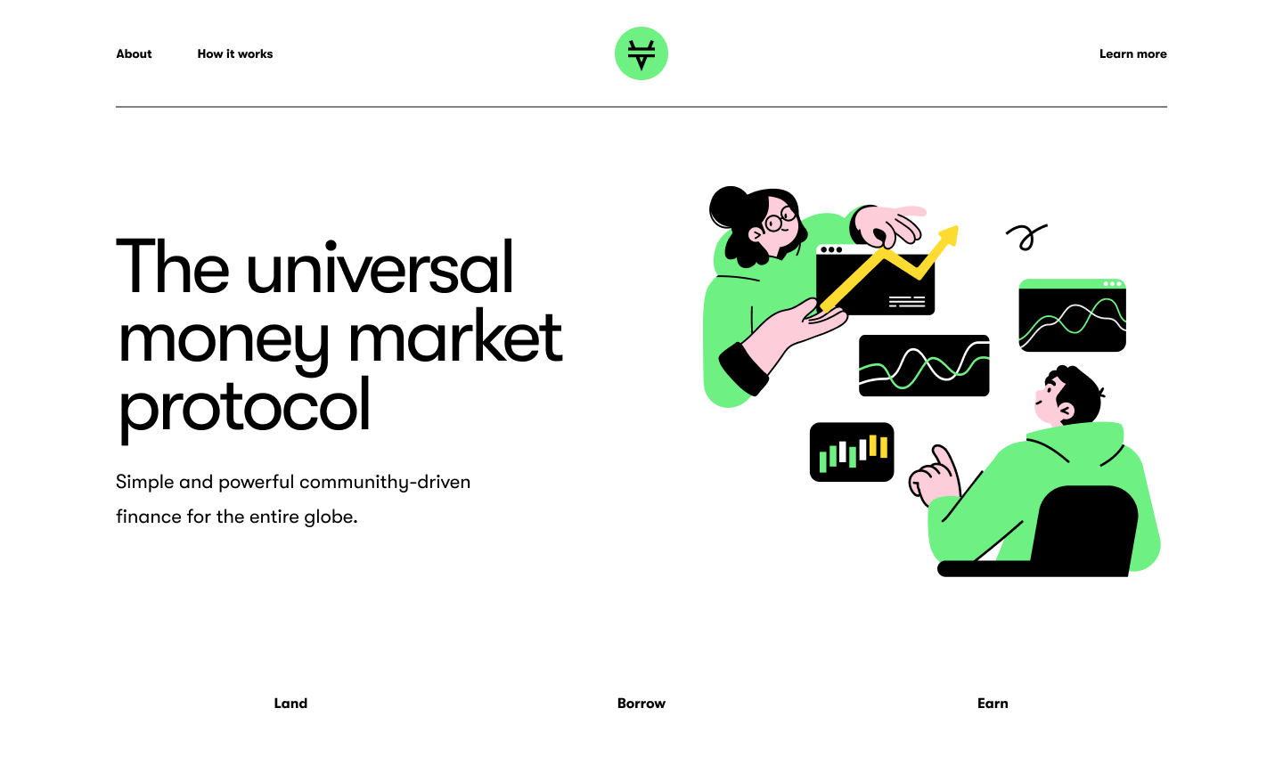
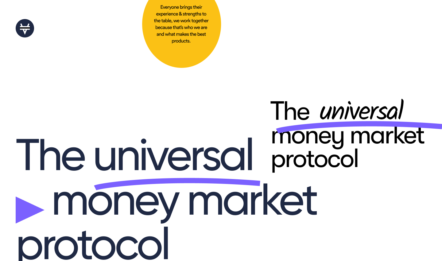
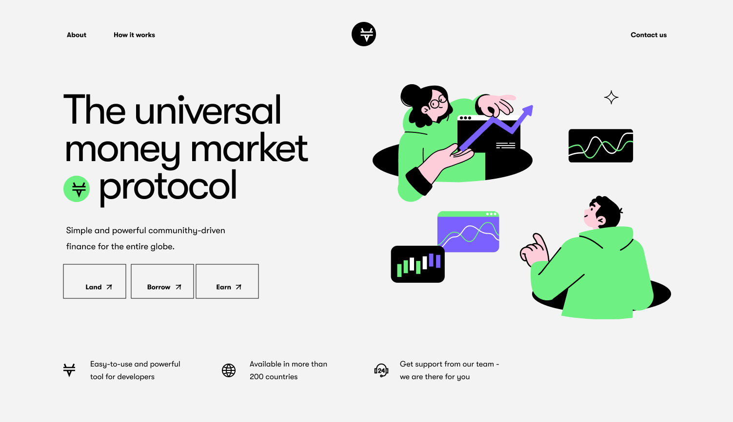
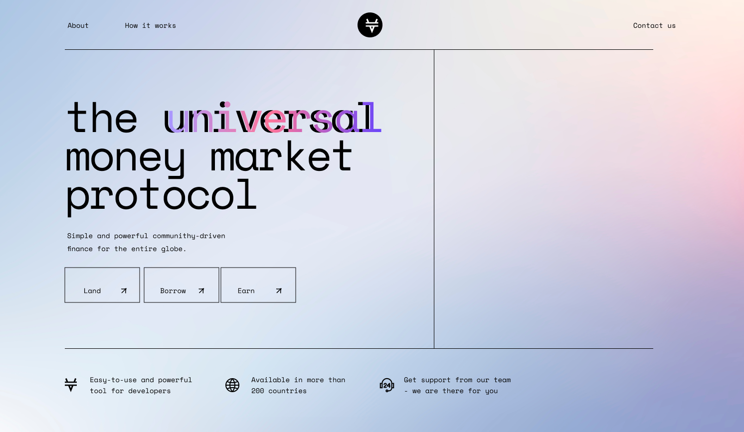
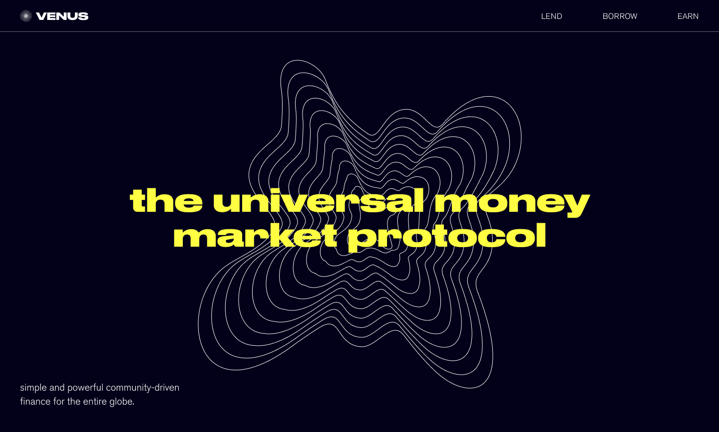
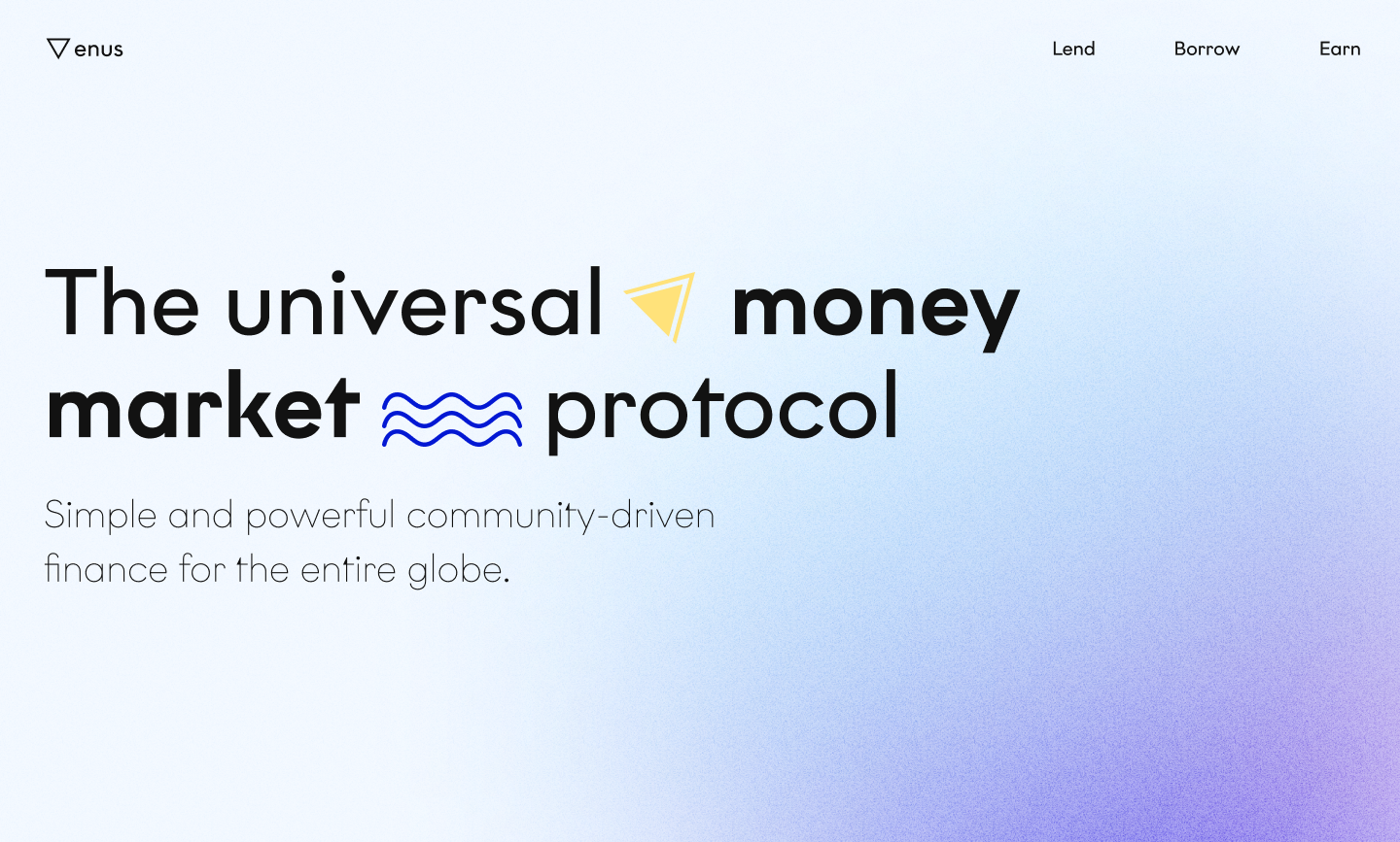
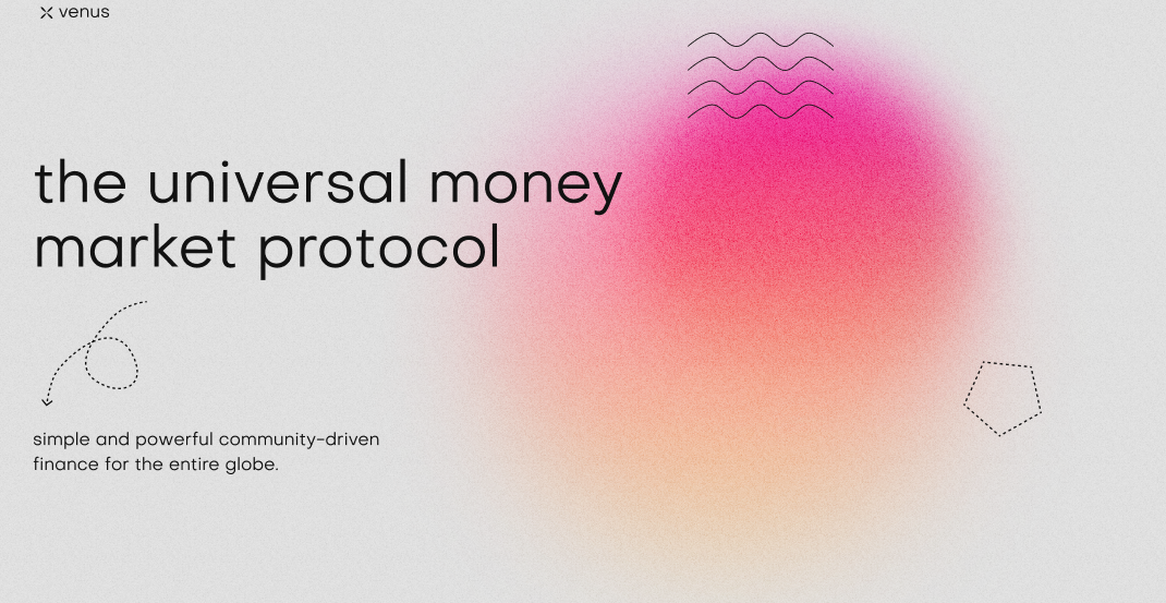
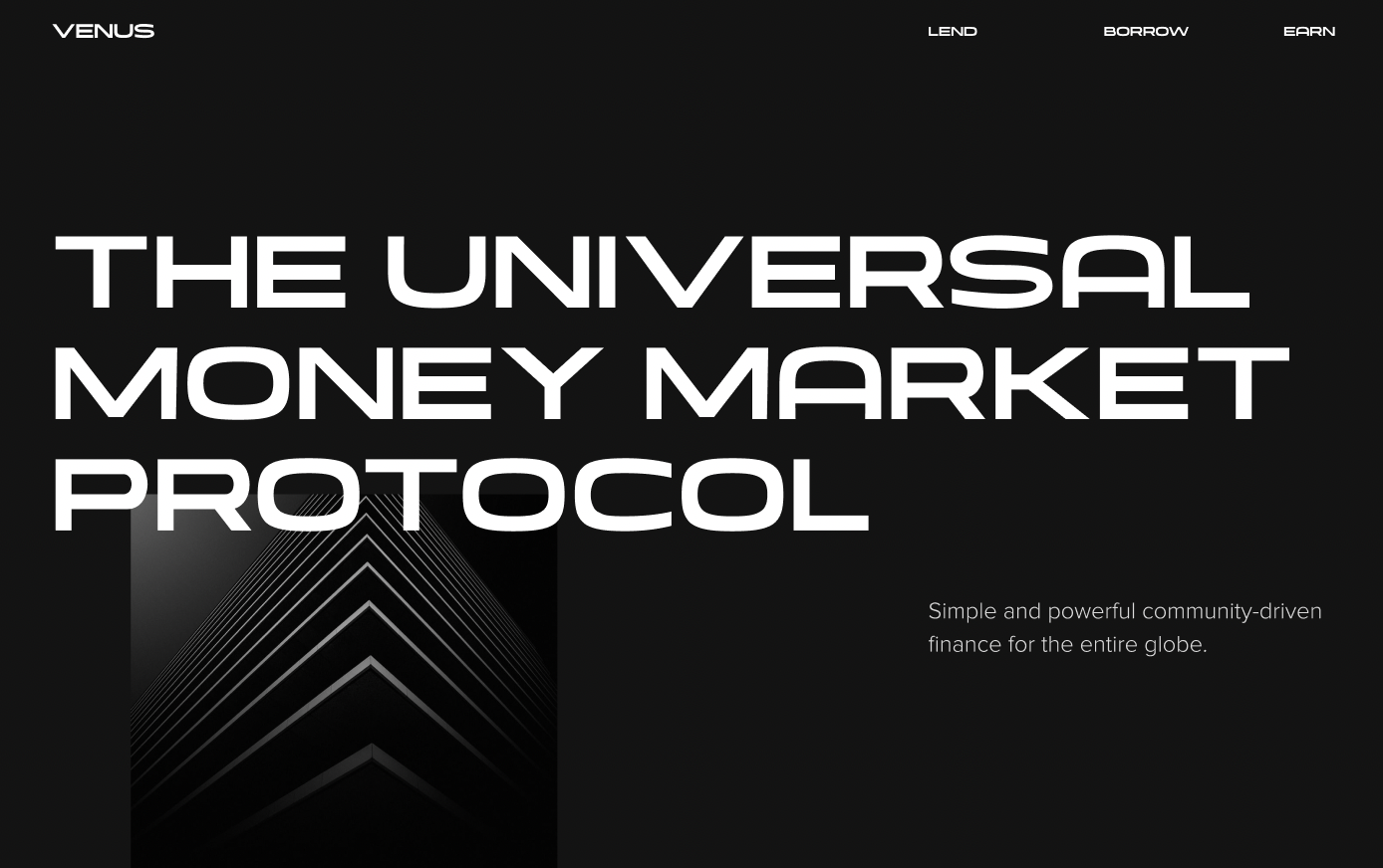
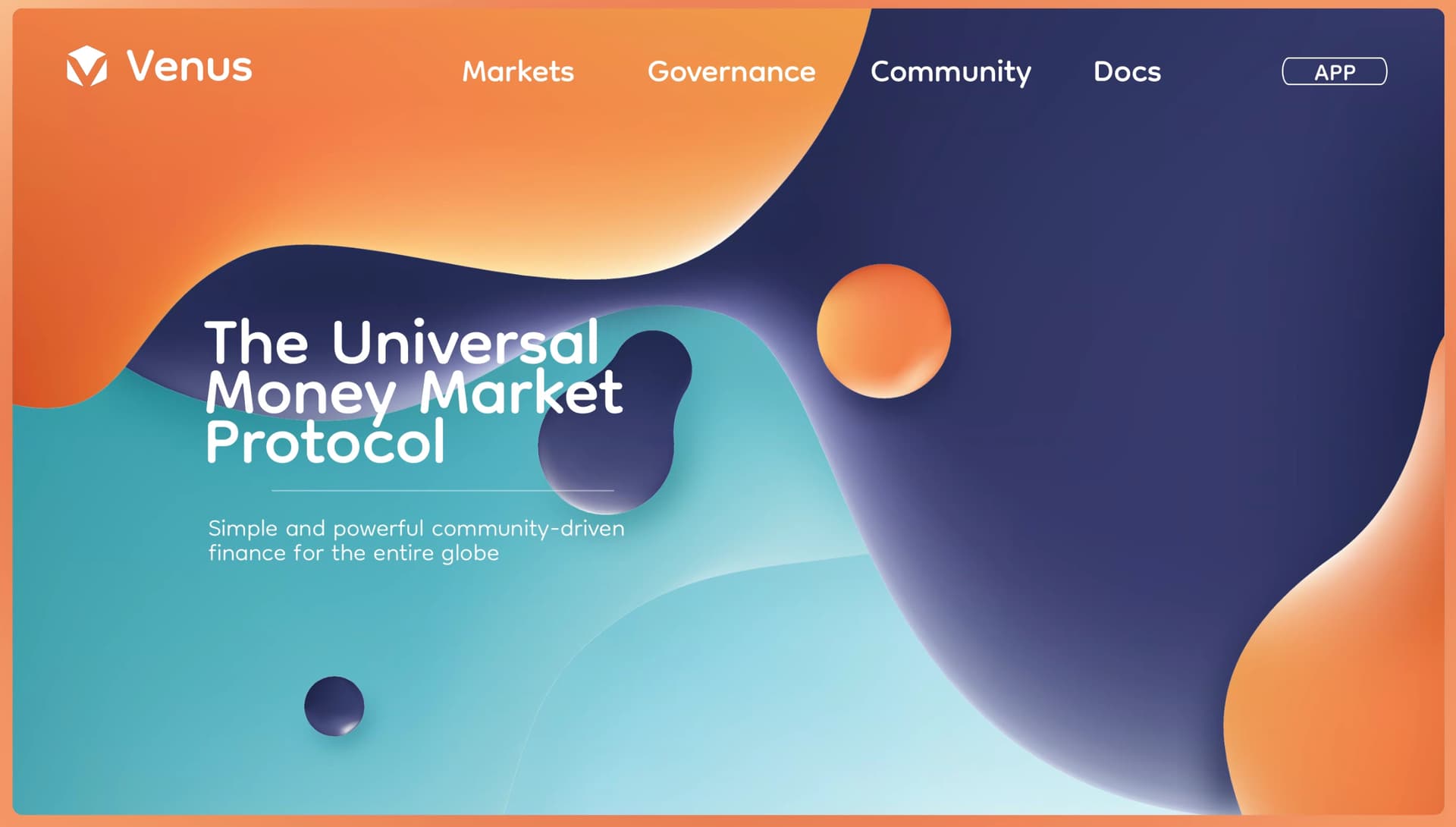
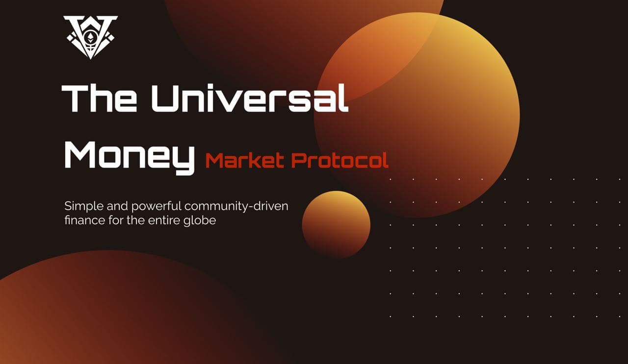
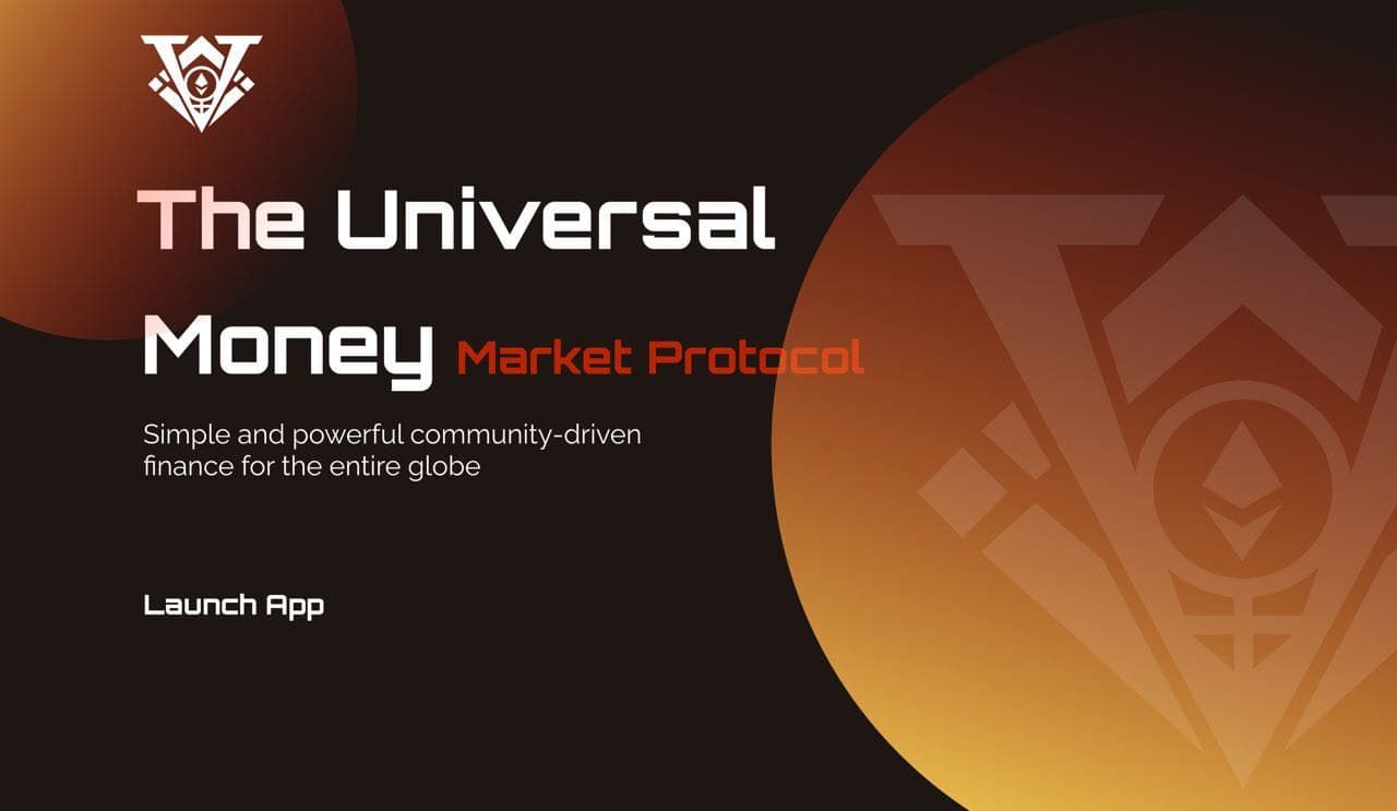
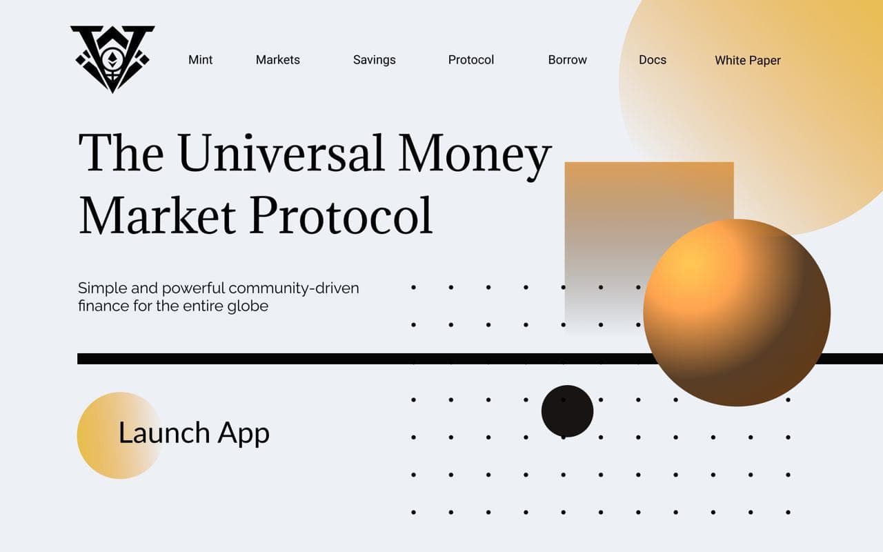
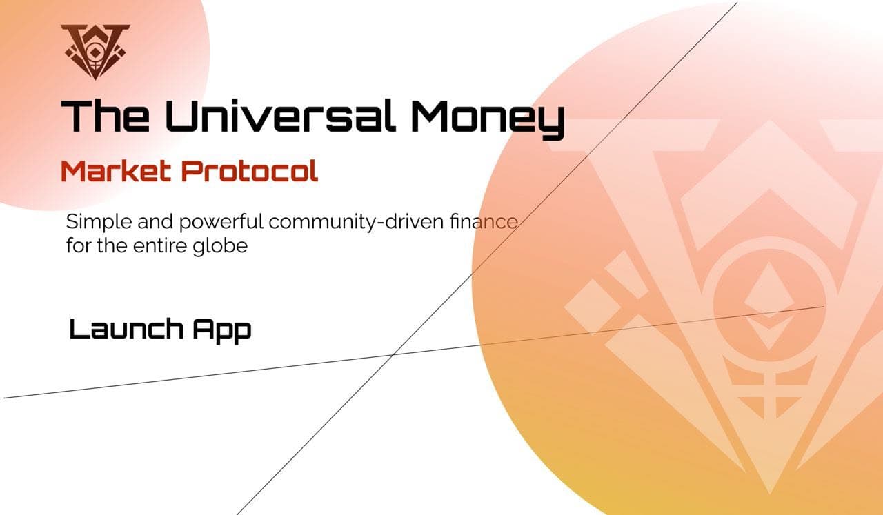
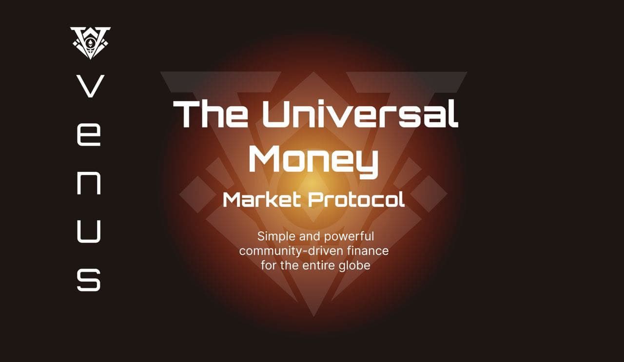
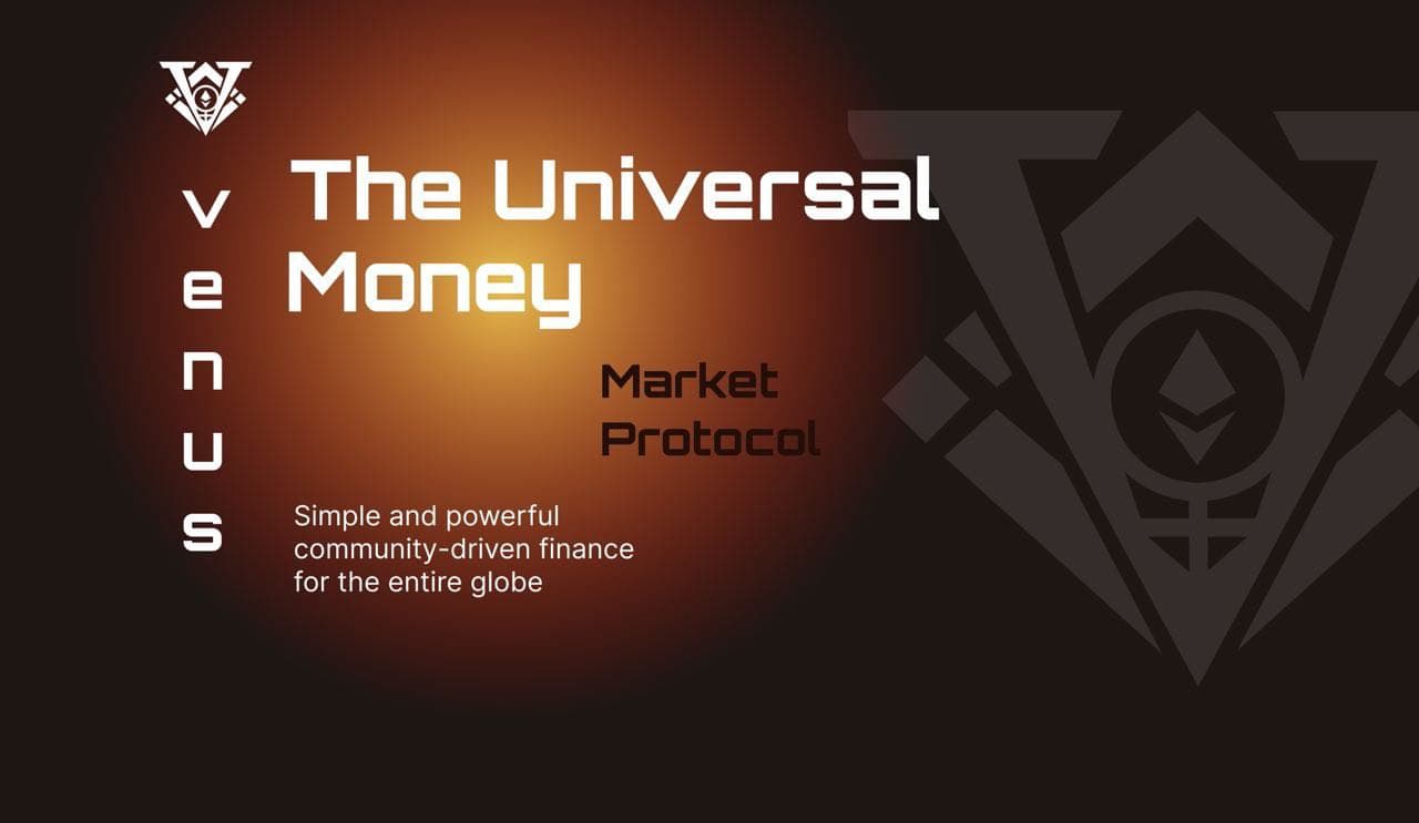
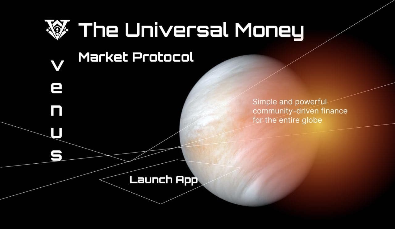
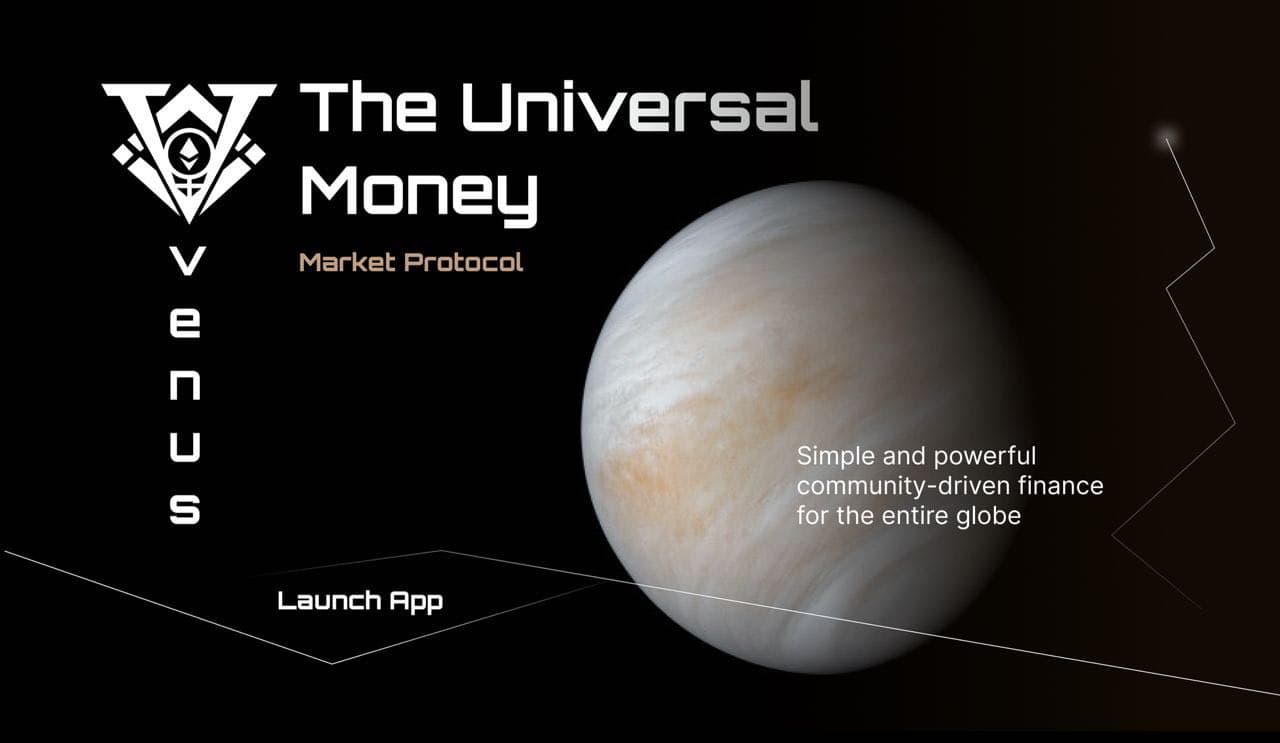
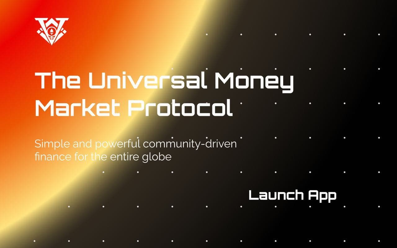
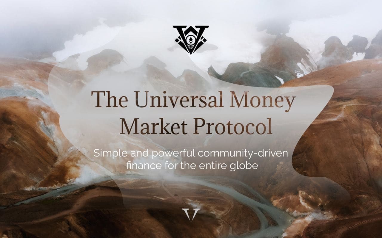
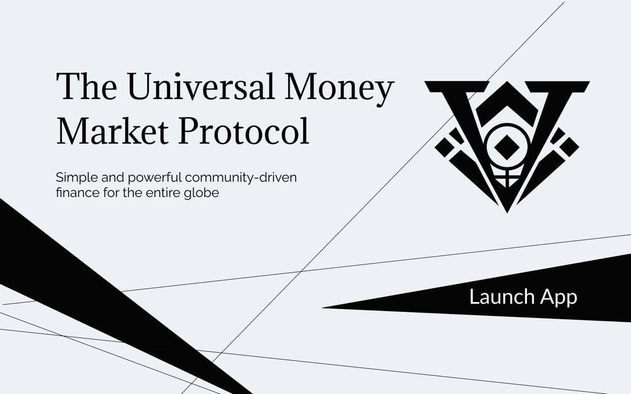
We received some landing page drafts this week. Let us know your feedback on these options:
I really like redesign and modernization idea! First one looks best of these but i think that we can do really much better and more graphically appealing
I think perhaps a combination of the sixth and the last one could be good. I would like to suggest that the colour yellow be included, since yellow is part of the BNB brand since Venus’ home is on BSC, it should reflect that vai yellow.
when it comes to the UI of the actual lending/borrowing protocol, i honestly wouldn’t change it. i like the UI and it’s pretty easy to navigate.
Hi Ben,
Great presentation on Friday.
Here is Jaime, Mod on Spanish Community and early arrived user on Venus!
I would like to have the chance to share a draft-proposal of what-i-see could be the rebranding new vision opportunity.
Let me just share some thoughts on that I tried to show with this landing-page:
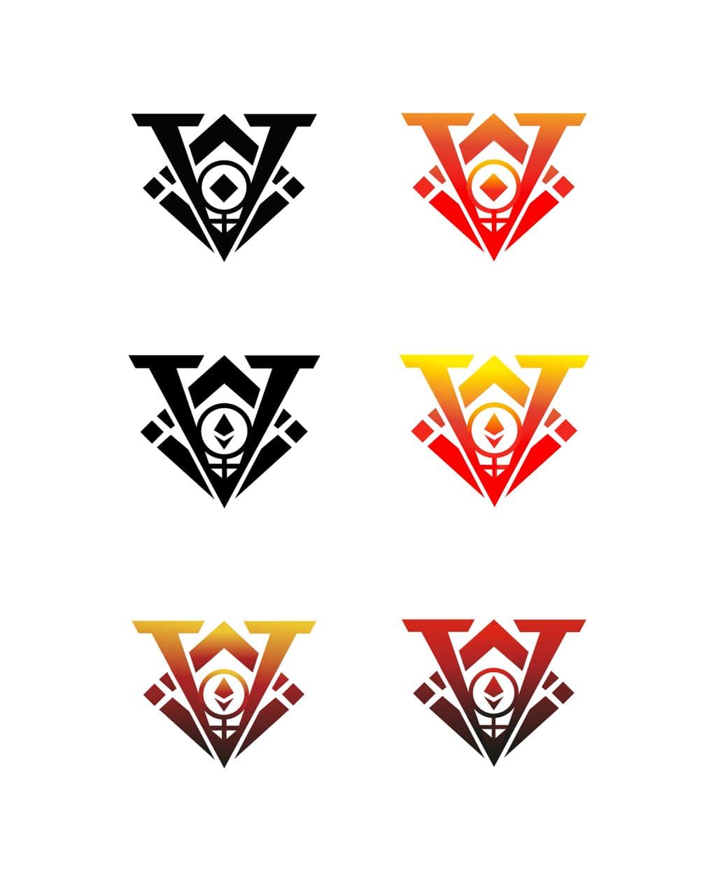
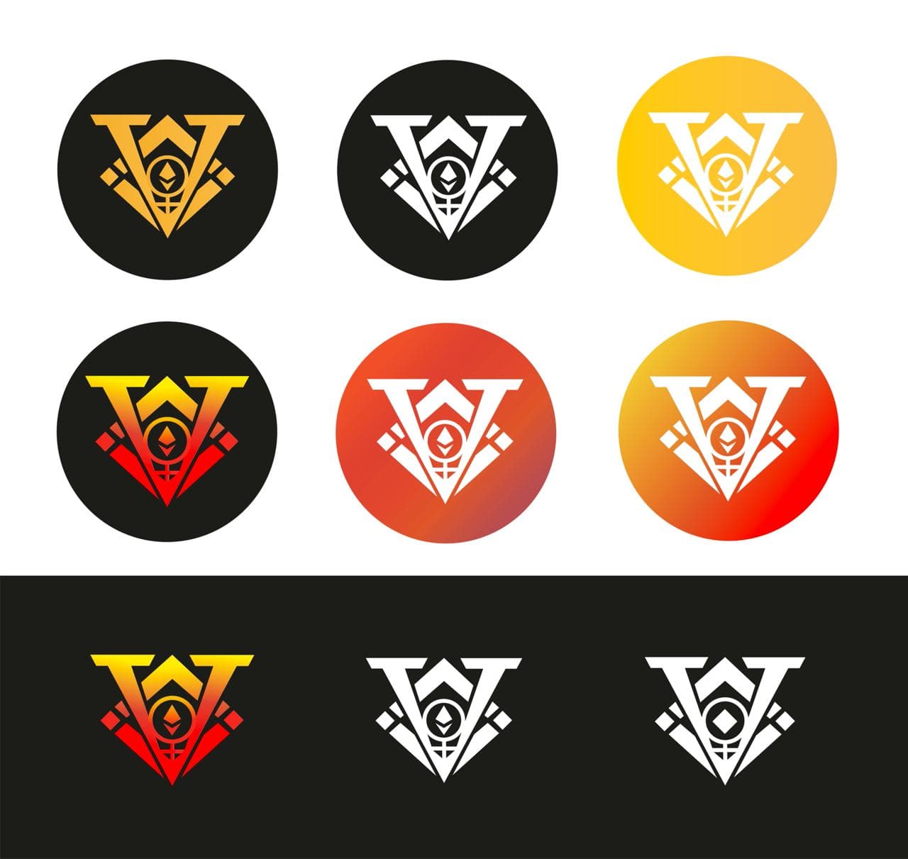
New Logo: Blockchain and connectivity inspiration.
New ‘Complementary’ Colors:
-Strong Orange for $XVS: Innovation + Markets meaning/feeling.
-Dark Blue for $VAI: Liquidity + Stability meaning/feeling.
Landing Page: Wanted to show some simplicity and professional look but maintaining the creative/fun spirit shown on many Blockchain projects, specially under BSC. Also in other hand, wanted to give a feeling of “liquidity and flow” needed on this kind of DeFi products.
Also, my proposal of what should be accessible from Top page.
I Hope it could give some ideas to the design team!
Hello,
1, 6 and 9 so dark,
4 and 5 like minaprotocol.
8 like VISA,
Please be original!
The most suitable of all these is the 6th one. Simple, plain and colorful.
Hi, yes this is good but design can be developed.
You might want to consider changing the font and making it a little smaller.
Smoother transitions can be made between colors.
maybe you can make the edge shapes a little smaller.
These are just my thoughts
Number 6. Clean and simple - this is what need! Please don’t do mistake with those “SAMURAI” designs, they are not good at all. Need also new app desing, wich is outdated. App desing simillar to number6 UI.