nice looking design, congrats!!!
Yes, this is much cleaner, than other ones “Samurai” and looks mature. This I would use.
Hi community,
Let me show you something I have just finished for you… 
But first, thanks for your positive feedback on my initial proposal!
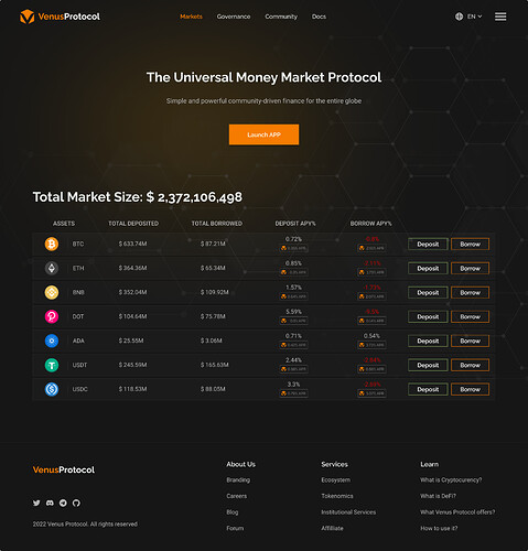
On this one I wanted to show a more professional look based on your comments:
· Dark Theme
· Institutional focused
· Accessible and useful information
Share your thoughts and like it if you wish!
PS: I did it in 8H and TBH, is my first design with Figma, so I am really happy with it! 
This one looks the best I’ve seen so far I would just like to see added things like the number of suppliers / borrowers / tvl / daily liquidations in Boxes  i like it by the way, I think it would look amazing if it had some interactive element, for example when we move the mouse over a web page, that the structure in the background would stick to the mouse cursor and maybe the area was backlit with orange (just an idea if it was selected)
I really like this one please implement this on website
I like this because it is such a detailed website
Me gusta ,
Esta muy bien
Looks good Jaime. It looks professional yet simple, easy on the eyes and i like the combination between the darker colours and the light ones. Looks nice. Got my vote!
I agree. I a bit more info for each pool would be nice. Perhaps for the supplier/borrowers/tvl info, you can just hover your mouse cursor on top of the crypto, like BTC for example, and a little pop up will come out and show that info. Just a thought.
That´s a nice idea! the proposal in any case is for the ‘Landing Page’. Agree with you that DApp should include as much information as possible 
For the logo, I think it’s too busy. it should just be simple, with the ‘V’ and a yellow circle around it. I would not want to include a specific ecosystem because what if Venus goes cross-chain? then it won’t pertain to just one ecosystem.
As for the website interface, not the app, I like the picture 4 and 6. Jaime just posted his version for the app and I think Your picture #4 can go well with his.
6th Better than other
this is ok for me!!! 
Hi community!
Thanks for the feedback,
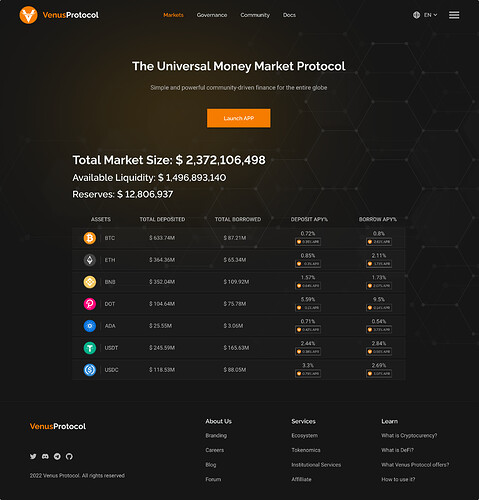
I just wanted to share the proposal based on your comments:
· Logo: I am doing a new proposal, aligned with current Logo, that people loves it, but with some refining to accommodate the image to the New Team. Wanted to keep it simple and on single color as most of the coins are.
· Added more information about Protocol Status (Liquidity & Reserves) that should give a better insight to Depositors/Investors.
· Removed Deposit/Borrow buttons to not confuse Landing Page vs DApp
· Red color removed and Contrast improved
Regards, enjoy the weekend and share your thoughts 
PS: If I have time I will try to do a ‘Light’ version of this Dark theme.
Very nice the logo and the whole page very clear.
congratulations… a 10
Thank you for making this possible change.
I like very much.
good design
Looks really nice! Simple, yet beautiful. Yes, a light mode option should be added for both the landing page and Dapp. But other than that, I like it!
The logo you put up there looks nice too.
Nice work man
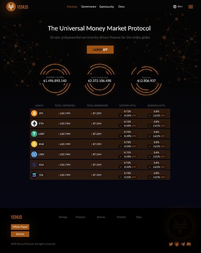
That´s a great based mod! I love those circles !! 


