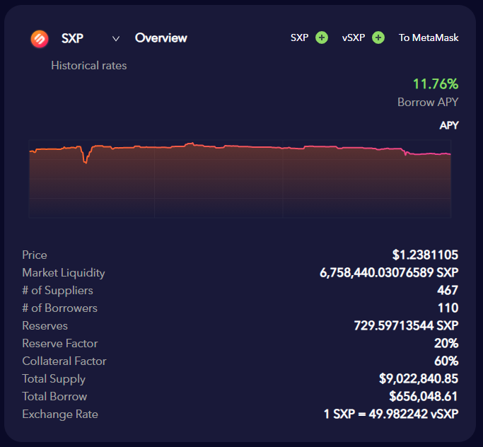
Yields fluctuate every day and the numbers currently displayed are not necessarily a good representation of what to expect on a longer term.
By adding historical data for the supply/borrow APYs, mainly 7-day and 30-day trailing value represented on a graph, it can add a layer of trust and is a worthy upgrade to the UI to encourage more people to use the Venus ecosystem.
I propose a secondary screen when we click on either of the Borrow or Supply APY and Distribution APY. The chart would also allow to use combined net APY (Borrow/Supply + Distribution)
Additionally, this can be expanded to the VAI APY too
For reference/inspiration, here’s the AAVE dashboard for DAI:
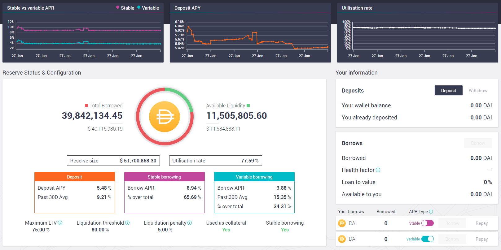
While I appreciate the minimalism of the Venus UI, I find that Aave has a much more comprehensive dashboard and hope that some elements can be borrowed there to improve Venus.