Simple Summary
Gauntlet is excited to announce the launch of our newest risk dashboards. This release is the result of months of hard work on the part of our designers, front-end engineers, and data scientists who rebuilt the dashboards on a new technical infrastructure that will enable us to rapidly iterate and release new features. This is an important pillar in our commitment to the Venus community around bringing visibility to the data and analysis that drive our risk recommendations.
Context
We launched the previous version of our risk dashboards back in November 2021 (we incorporated Venus in November 2022), when the DeFi space was very different. Novel risks have emerged, including new forms of price manipulation and price inequivalence (”depeg”) events, amid rapidly changing market conditions. Our team is consistently building new models and methodologies to address emerging threats. The launch of these new dashboards enables us to easily share these new data visualizations externally with the community, and have the distinct advantage of refreshing on regular intervals (compared to screenshots we currently include in forum posts).
Key improvements made:
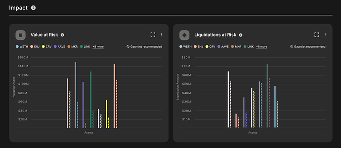
- We’ve added a protocol summary page that shows an aggregate view of risk on the protocol and which markets are driving it. To start, we include aggregated VaR and LaR numbers. Later this quarter, we will add protocol-level reserves.
- We’ve swapped Borrowing Power in place of Borrow Usage as our measure of capital efficiency. Borrowing power is defined as the total available borrows based on collateral supplied to the protocol and their respective liquidation thresholds. The available borrowing power represents the upper threshold of maximum capital efficiency that can be realized by current parameters. Borrow usage is the realized capital efficiency which is easy to calculate in the current state but very difficult to project into the future. Therefore, we will start contextualizing our parameter recommendations with the impact on borrowing power as well as the current usage.
- Recommendations are centralized on a single page, along with relevant statistics and expected impact graphs. This will make it easier for users to evaluate current proposals, without needing to click into each asset to find the relevant context.
- We converted the visual depicting the impact of our recommendations from a pie chart to dual series column charts, whereby the hashed columns of a specific asset represent the VaR and LaR values after our recommendations, and the solid bars represent before. Bar charts visualize the magnitude of impact in addition to the relative distribution across assets.
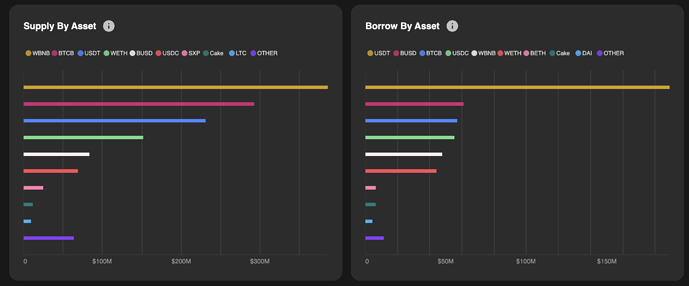
- We have rolled out new Market Health pages, showing summary statistics around the user position data we ingest. Visualizations include concentration graphs, historical supplies and borrows, growth of active addresses, among others. These data points are monitored by our team (actively as well as through automated alerts) to identify position-specific risks and trends that result in off-cycle (unscheduled) forum posts with specific recommendations. In addition to making this data visible to the community, the new tech stack will enable us to gather more granular statistics around how users access this page, giving us better insights into which graphs receive the most attention so we can continue to surface valuable features.
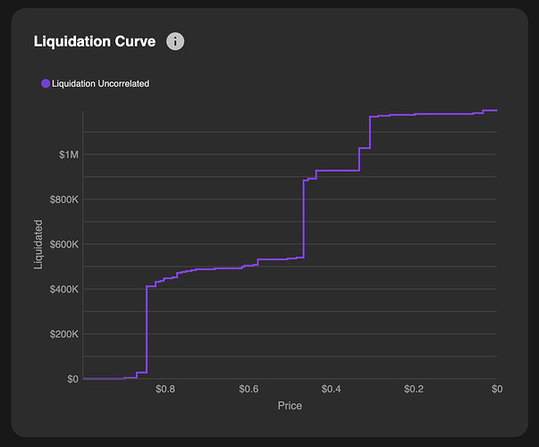
- We removed the heatmaps in favor of “Liquidation Curves” which show the cascading liquidations that would occur at various price points for a given asset. The curves remove noise for the user, generated by asset interdependencies, and are therefore truly asset specific data points. Our simulations continue to consider correlations when calculating value at risk (VaR), but we hope that separating visuals into specific drivers of risk will make digesting the data easier for users.
- We have added tooltips for each and every chart and table in the dashboard so that users can access more information about how we calculate each metric as well as the frequency.
- Navigation between markets is improved via the “breadcrumb” menu added at the top of the dashboard screens, which enables users to jump between assets and markets. This design also enables us to scale to many new markets and assets in the future.
Upcoming features
This quarter we will put a real focus on surfacing more data used in our decision-making around parameter recommendations. Most of these will be appear at the asset level, though we will surface additional summary statistics at the protocol level as well. Here is a small preview of some features launching soon:
-
Cap Usage Graphs
- We will surface cap utilization as part of our borrow and supply cap methodology. The charts will show the current caps (which are denominated in tokens) and contextualized by the respective borrow / supply balances. Cap utilization helps us decide whether to consider raising caps. Some assets might see very temporary utilization spikes that do not persist, while others experience steady increases in utilization. We use these graphs in conjunction with our market alerts to make recommendations.
-
Liquidity Graphs
- We ingest both centralized exchange and decentralized exchange liquidity data on a continuous basis, to inform decisions around asset listings (and delistings), borrow/supply caps, and for use in our simulation engine. Generally speaking, we separate liquidity into two numbers: local liquidity, which looks at buy and sell orders on the local chain of a given market, as well as global liquidity, which looks at aggregate liquidity for a given tokens across chains. Thinly traded assets are more risky as liquidators would be challenged to realize profits on larger transactions. The expected slippage (price impact due to transaction size) is calculated in our simulations and helps us set collateral factors as well as borrow and supply caps.
-
Updated handling of deprecated and frozen assets
- We will roll out UI improvements to indicate assets that are frozen or deprecated, making it easier for users to navigate collateral risk in these contexts.
Quick Links
- Gauntlet’s updated Risk Dashboards for Venus
Next Steps
- We welcome community feedback on the above and value the community’s continued participation in protecting the market health of Venus.
- Which features are your favorite?
- What information would be useful to you?
- Feel free to DM us as well


